Industry Design Project
Simple but Needed, Inc.
Summary: An onboarding redesign for Simple but Needed (SBN), a business software suite used by organizations to manage checklists, scheduling, reporting, and task workflows. This project redesigned the onboarding flow to guide users through account setup and app configuration entirely within the product, without requiring outside assistance.
Solo project: stakeholder interviews, journey mapping, sketching, prototyping, and moderated usability testing.
Problem
New users of the SBN software suite were failing to complete onboarding at a high rate. The existing process relied on an email with written setup instructions, but a large share of new clients (many of whom have limited technical experience) were dropping off before completing account creation or logging in for the first time.
Solution
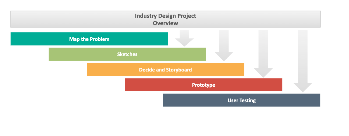
The updated SBN onboarding process seeks to create a better experience for clients by providing a well organized process for users to be guided through the introduction of the software and be able to quickly learn how to do critical tasks. The process used is a modified Google Ventures design sprint created to rapidly map, plan and test ideas.
Map the problem
Key Insights
- Nearly half of new users have limited technical confidence, making self-directed setup feel risky rather than empowering
- Users had no way to distinguish configured apps from unconfigured ones on the home screen
- There was no in-app tour or help system. Users who got stuck had no recourse other than contacting support
User Journey
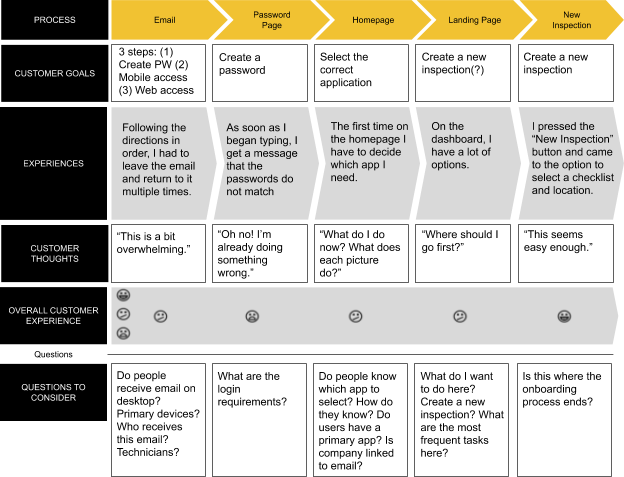
To understand where the drop-off was occurring and what users needed, I went through the onboarding process myself end to end, then conducted stakeholder interviews to map the experience from the business side. Stakeholders identified two consistent pain points: users couldn't tell which apps in the suite were active for their account, and there was no fallback guidance once a user was inside the product.
Sketches
Preliminary Sketches
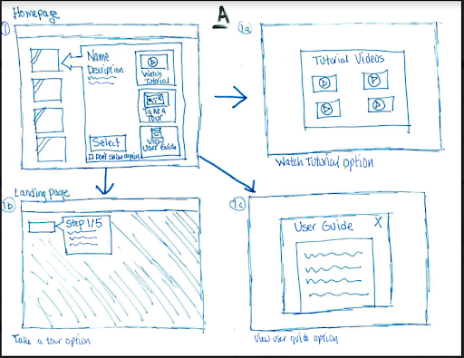
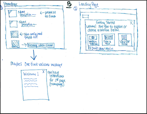
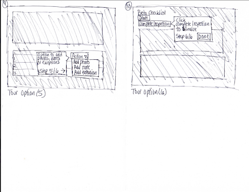
I came up with a few preliminary sketches to help decide which direction to go to build an onboarding flow. The stakeholders decided that the most important screen would be the homepage, which should allow users to see a description of the app and see if that app was configured for their account. They also prefered the idea of combining this home screen with options to have tutorial help.
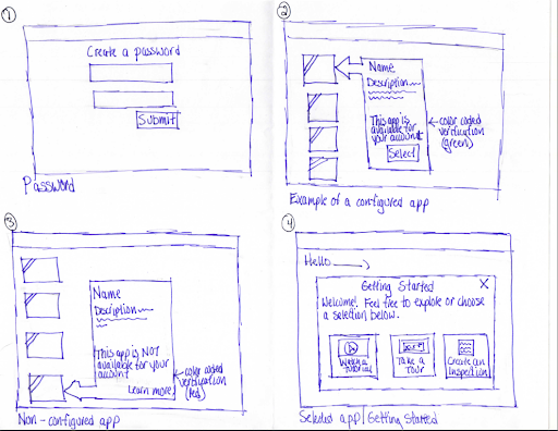
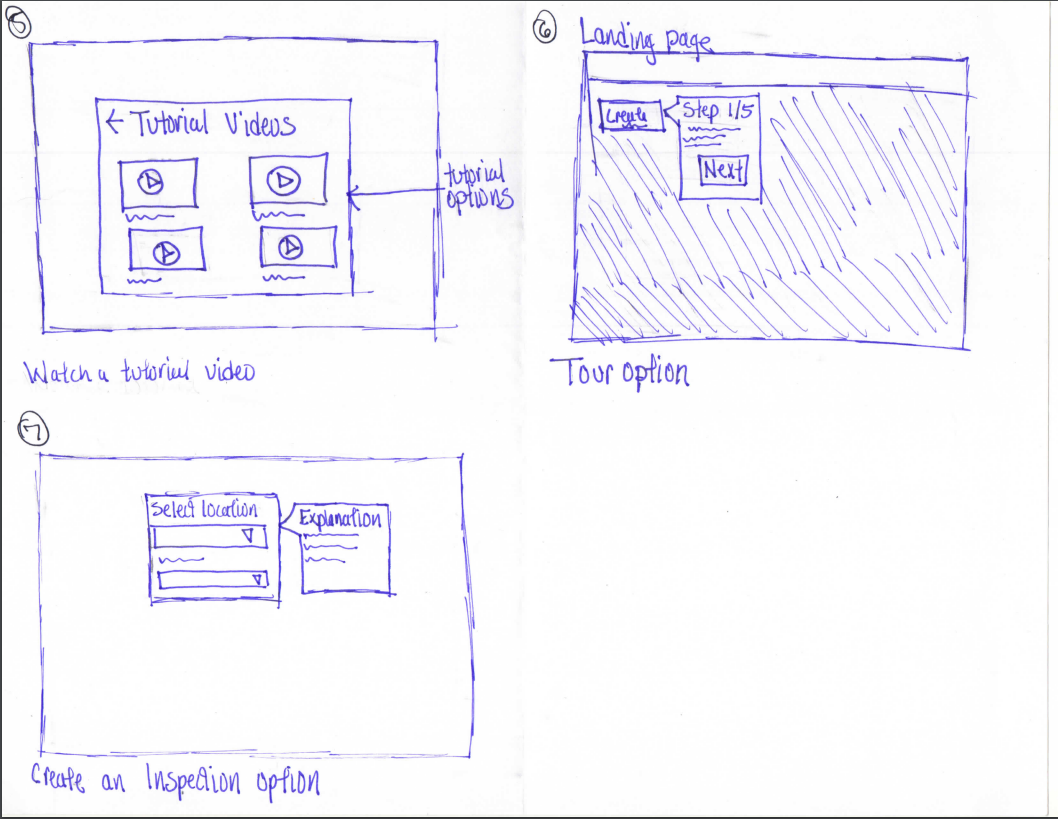
I explored two directions for how to surface onboarding help without disrupting users who didn't need it.
Option A combined the app name, tutorial options, and configuration status into a modal that appeared after clicking an app icon on the homepage, keeping help more contextual and tied to the specific product the user was trying to use.
Option B separated tutorial options onto a standalone "Getting Started" window on the landing page. A more prominent but less contextual approach.
Decide and Storyboard
After reviewing both directions with stakeholders, we aligned on Option A. The key reason was persistence: by tying help to the app icon rather than a one-time welcome screen, users would always have access to guidance when they needed it
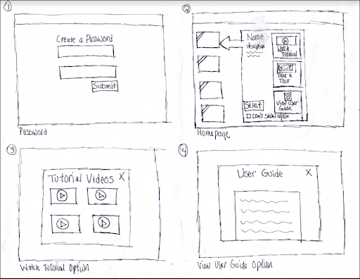
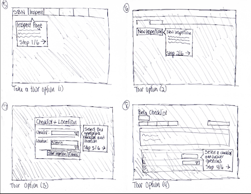
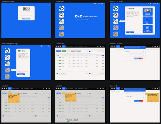
With Option A approved, I built a storyboard of the full flow, into the app-specific modal, and through the step-by-step tour. The storyboard covered both the configured and non-configured states.
Prototype
Based on the approved storyboard, I built a prototype in Sketch covering the full onboarding flow. The testing goals were to confirm that users could navigate the flow without instruction, identify any points of confusion, and surface anything users expected that wasn't present.
Although no style guide was provided, I kept the color scheme consistent with the existing SBN website to signal continuity. The prototype included multiple homepage states (configured apps, non-configured apps, greyed-out unavailable apps) and a full three-step tour sequence to simulate the guidance experience.
Validate
Moderated in-person usability testing was conducted with five participants representing people with varying levels of technical comfort who were new to business software tools. The primary goals were to verify that users understood each step of the flow without prompting, confirm that the tour system was navigable, and identify any missing elements.
Results from testing
What worked:
- Modal content after selecting an app. The information presented after clicking an app icon was clear and well-received. Users understood their options and could make a choice without instruction.
- Tour navigation. Participants found the step-by-step tour easy to follow. "I always knew where I was and how to get out if I needed to." The numbered steps combined with Previous, Next, and close controls gave users a clear sense of progress and control.
- Greyed-out app icons. The visual distinction between active and unavailable apps was immediately understood. Users appreciated knowing at a glance what was and wasn't available to them, rather than clicking into something only to find it wasn't set up.
Issues and how they were addressed
- Modal size. Several participants felt the modal was too large relative to the page, and suggested that a selected app could use the full page rather than an overlay. In the revised designs, the modal was redesigned to integrate more naturally with the homepage layout, reducing the visual heaviness while preserving the content structure.
- Missing app name labels. Users wanted to know an app's name before clicking it, rather than discovering it only after opening the modal. Persistent labels were added below each app icon on the homepage which reduced hesitation and made the home screen easier to scan.
- No completion signal at the end of the tour. Participants expected some form of confirmation when they reached the end of the tour. A success screen was added as the final tour step, acknowledging completion and offering suggested next actions.
Reflections
The most valuable part of this project was how clearly testing revealed the gap between what felt finished in the prototype and what users actually needed. The missing app labels and the absent success message were both things that seemed like small omissions during design but turned out to matter significantly to users in practice.
If this product continued development, the next priority would be personalizing the homepage to reflect each user's actual app configuration on first login This is so the distinction between available and unavailable apps is never something a user has to figure out, but something the product communicates immediately and clearly.