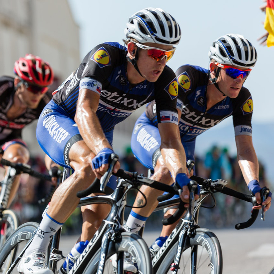
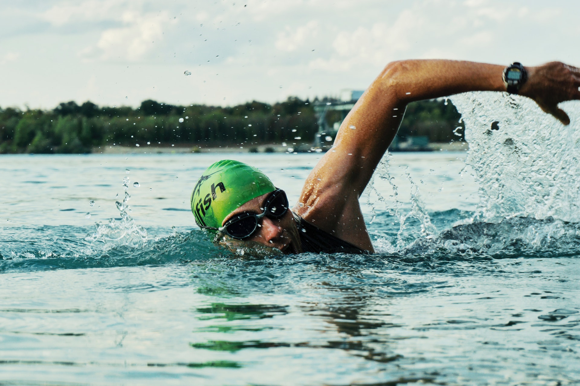
Athletic Flow
Athlete motivation and Tracking
Summary: Visually see and track improvement in sports training. Relive and review past successes to uncover hidden progress. Get motivated to keep pursuing goals.
My role: I alone completed the research, design and testing for the project.
Problem
Athletes often lose motivation when undertaking long term fitness goals because they don't have a method to visually track progress and see incremental changes.
Solution
Athletic Flow app seeks to alleviate this problem by providing a method to set goals and visually recognize and compare progress through photos and videos.
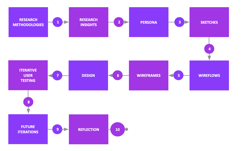
1 Research Methodologies
Research
Competitive Analysis
Interviews

2 Research Insights
- Motivation can be manipulated People do not have to just rely on personal will power to power through. There are techniques to increase motivation.
- Need to set challenging, realistic and attainable goals People respond favorable when they have a reasonable goal to pursue. One that they feel is attainable, yet just challenging enough to be exciting.
- Reliving past successes can increase motivation Athletes don’t often perceive the small improvements that they are making day to day and often forget past successes. Reliving these moments and seeing improvement can motivate them to keep working to improve.
Interview participants had this to say about motivation:
“I just have a feeling [that] maybe if I could be able to see it, I will be much more impressed. And say wow - that's what I'm achieving. And how much more could I achieve if I push for another year?”
“[When] I’m seeing some sort of improvement, I am motivated to keep going.”
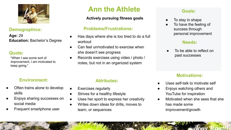
3 Persona
Based upon the interview results, I created a persona to represent what would be the target users for this project.
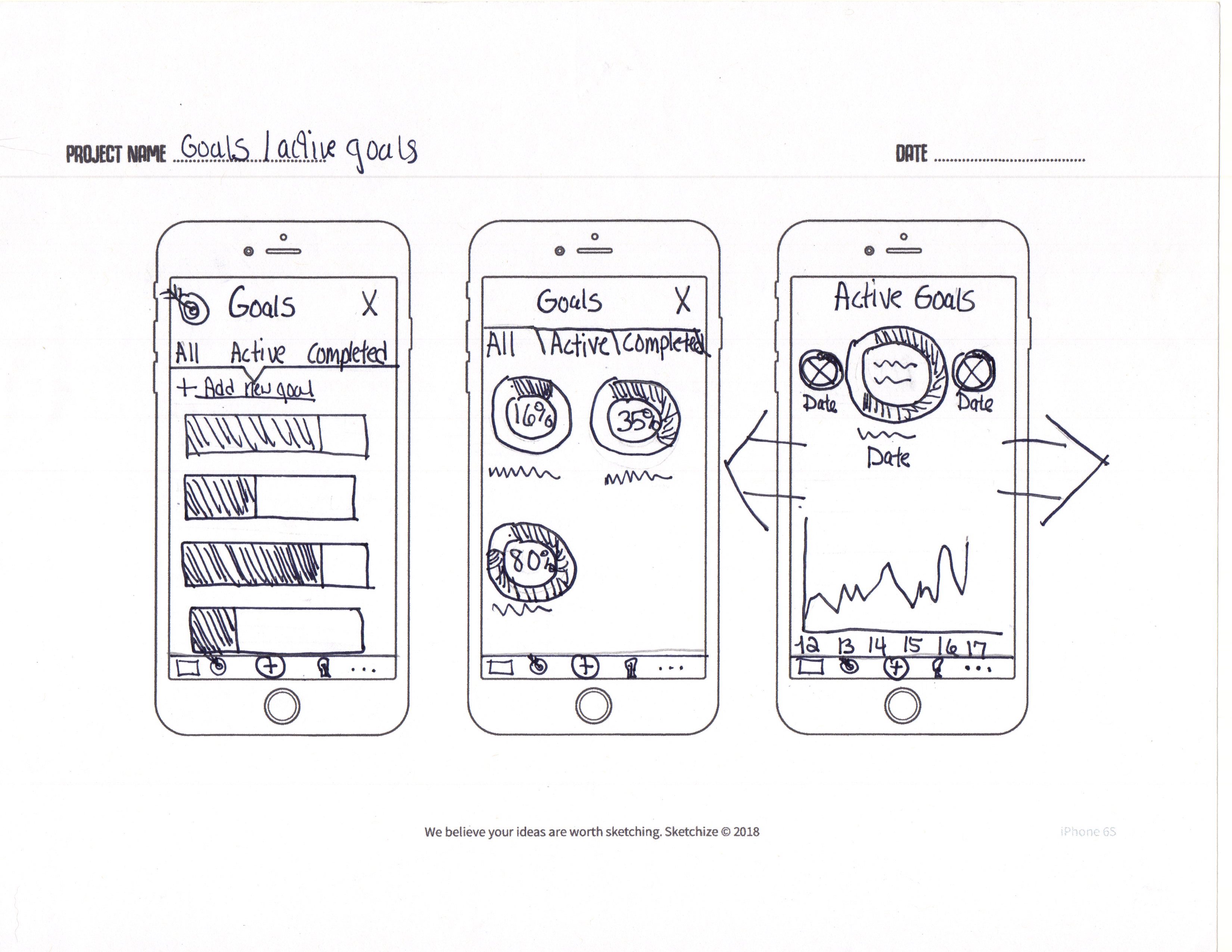
4 Sketches
Early Ideation sketches explored the concept of users being motivated by visually seeing improvements. Videos and photos were included because users indicated the importance of visually seeing progress.“Once you see results, it is the ultimate motivation.”
An inspiration section was added as users indicated that they would like ideas for exercise, techniques plays etc. Goals were also included as interviews and research emphasized the importance of challenges to stay motivated.
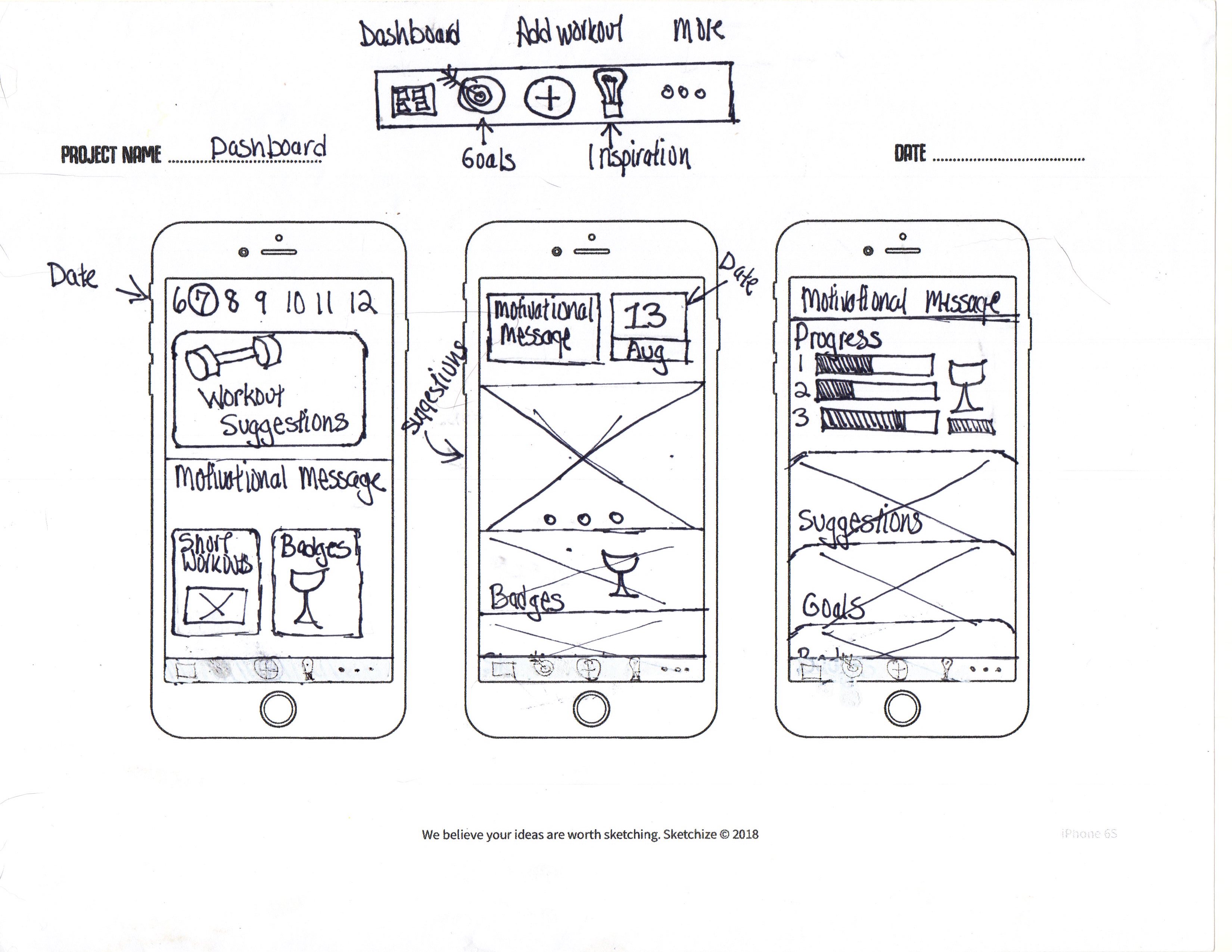
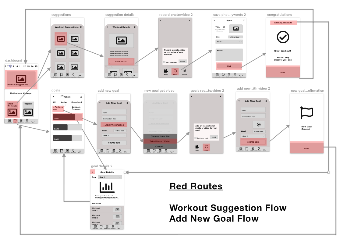
5 Wireflows
The two main red routes focused on getting workout suggestions based on the goals of the user and creating new goals that would be used to inspire and encourage motivation.
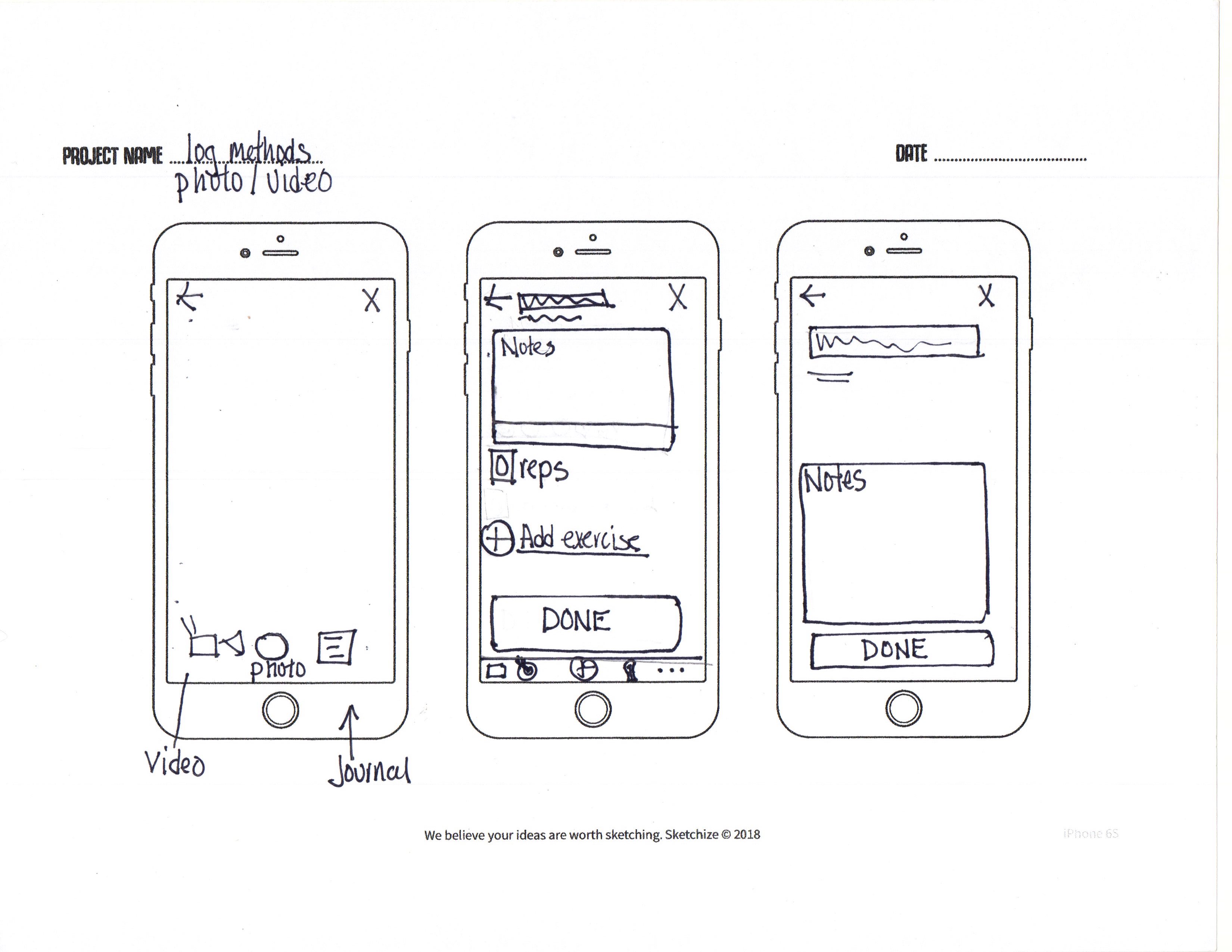
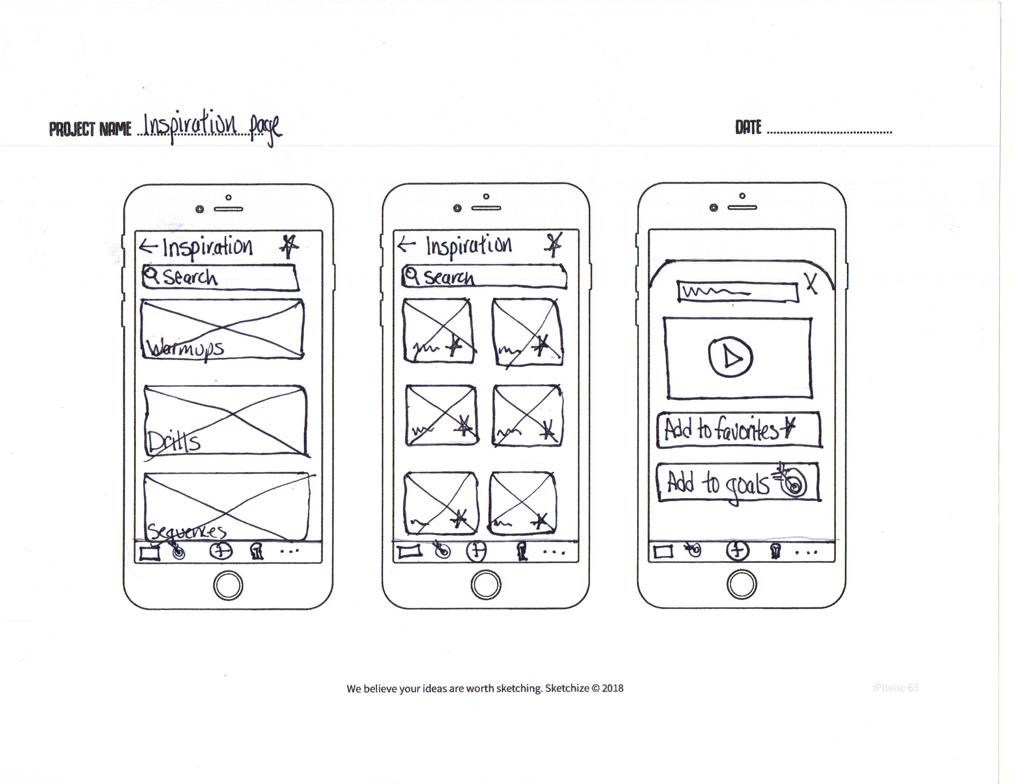
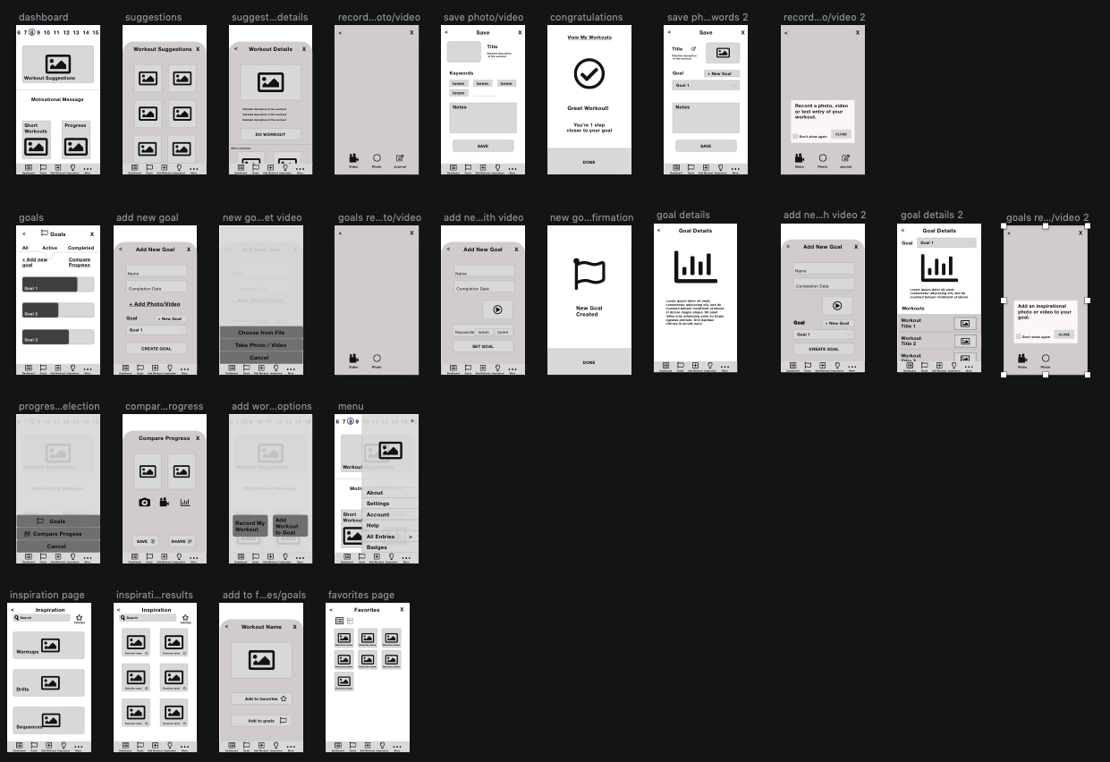
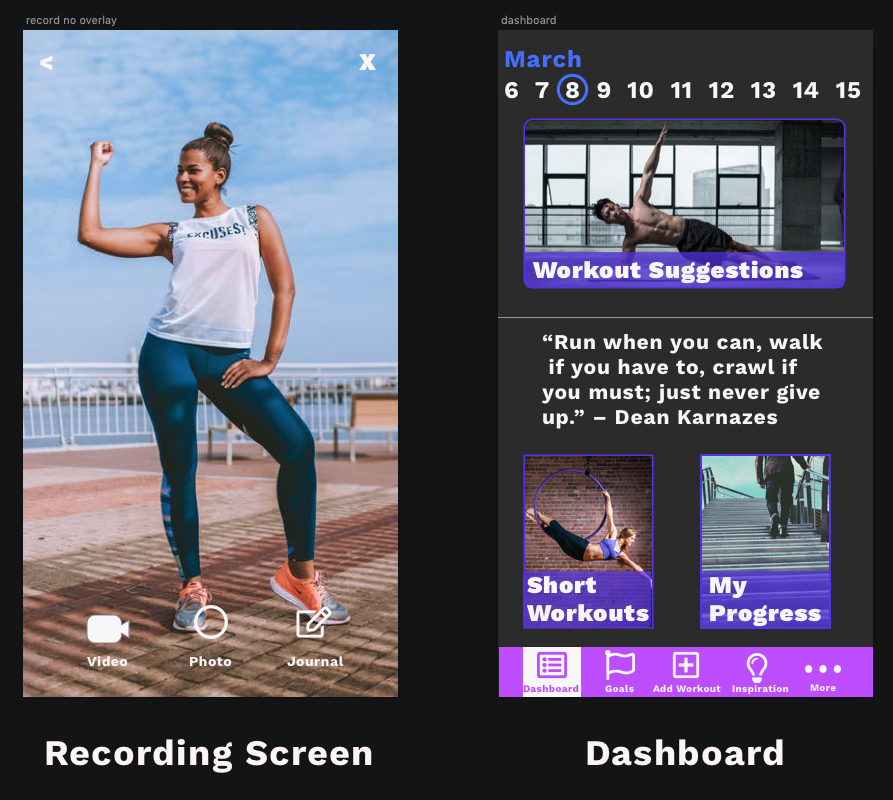
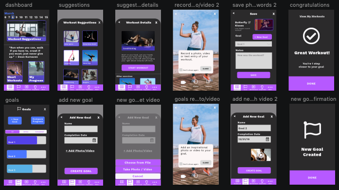
6 Wireframes
Wireframes were created that focused on the idea of inspiring motivation by visually revisiting past success.
“Once you see results, it is the ultimate motivation.” -User
Guerilla Testing the wireframes revealed that overall people did understand the purpose of the app. I was surprised to learn that users were not clear on the concept of using visuals to track progress. They would often pause when going from the “exercise details” page to the “video recording” page. I also received feedback that some of the word usage was not as clear as it could be.
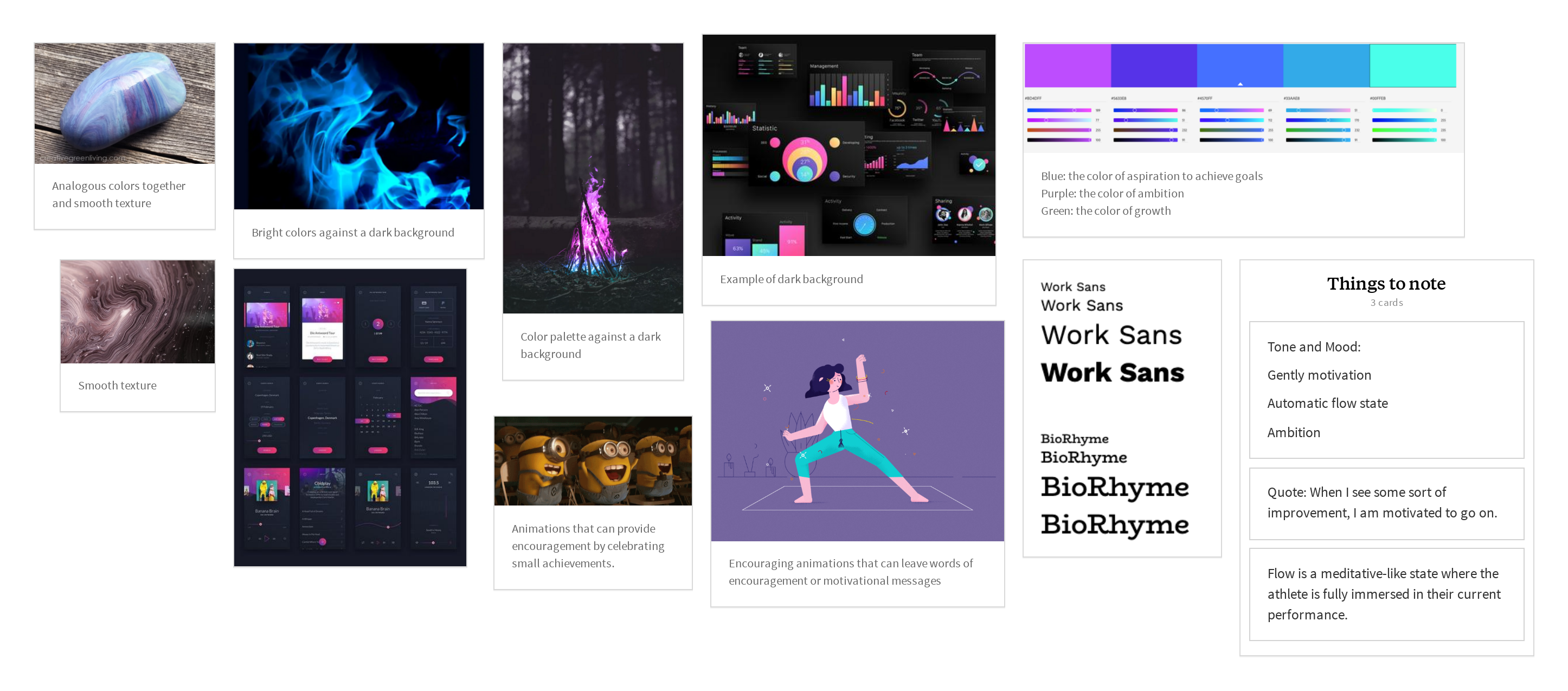
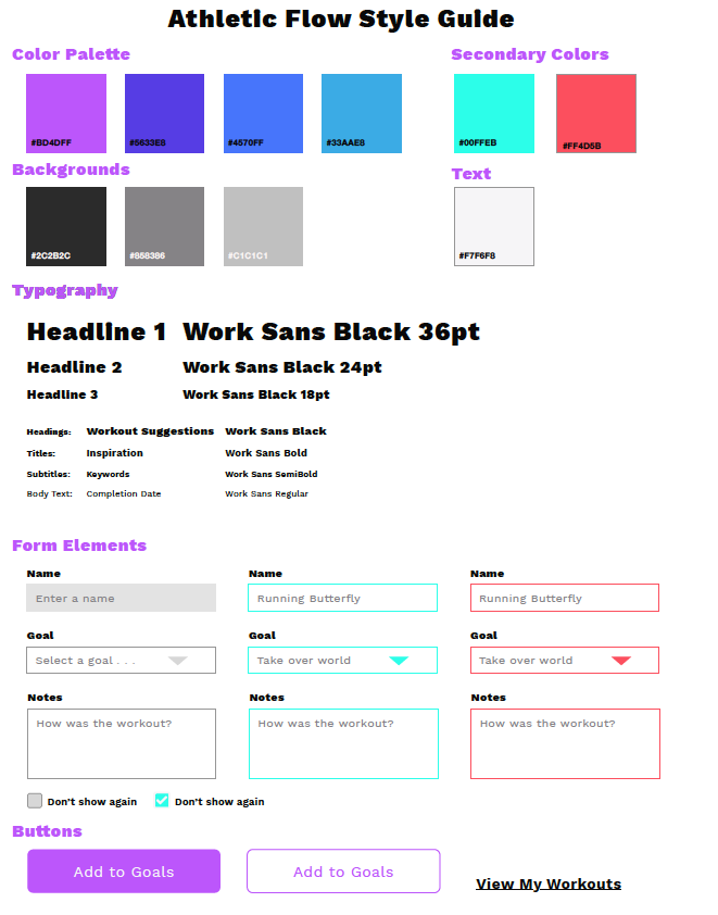
7 Design
In designing the prototype of the app, I wanted to utilize colors and design that would gently motivate and encourage the automatic flow state.
Color Palette: An analogous color palette was used to create a harmonious look.
Background: Dark backgrounds are less straining on the eyes and adds a stylistic look.
Typography: Works Sans is a san serif font family has a variety of weights and it is optimized for on screen usage.
8 Iterative User Testing
Round One
The first round of usability tests for Athletic Flow app were mostly performed using in-person moderated testing. One test was done using remote moderated testing. The main goal of the test was to uncover any usability problems in the red route designs of the app. Participants were all ages and included people that were actively training in a sport, seeking to improve in that sport and frequent smartphone users. Four people were tested and they were recruited from among athletic friends and associates.
Testing the prototype with users uncovered 4 main issues:
- There is still some confusion about the recording screen in the app and its purpose. This came down to users not understanding the concept of using visuals to reflect on progress. Once it was explained to testers, they appreciated the idea, but the flow was an unfamiliar concept to them that would need to be explained.
- The progress flow was not completely clear to users. I was shocked to see that one user in particular asked what to do to compare progress while on the dashboard, which contained a progress button.
- Users were not clearly understanding that they were testing an app that was specific to their sport. Users made recommendations and expressed expectations aligned with what one would expect on a fitness app (animations, timers, nutrition and resting times).
- User did not understand the date line at the top of the dashboard. To users, this line at the top of the dashboard was just a random line of numbers and they did not carry any meaning to them.
Round Two
I decided to update the prototype in order to prepare for a second round of usability testing. For the updates:
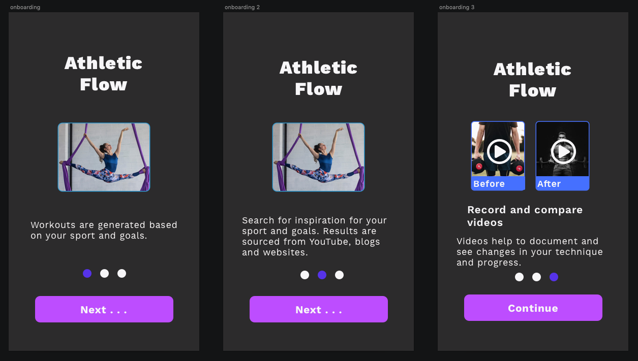
- Three onboarding screens were added to introduce concept, value of recording.
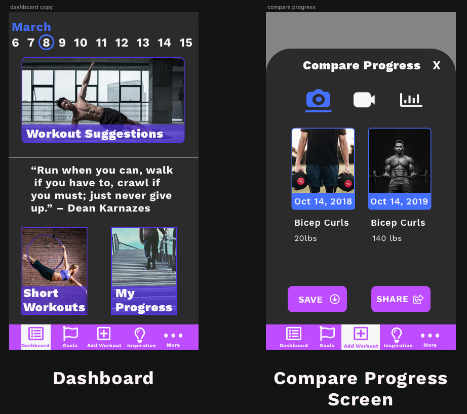
- On the Dashboard, the progress button was personalized and a month was added to the date timeline.
- The “Compare Progress” screen was updated to include notes associated with the photos/videos.
Results of Testing
I decided to update the prototype in order to prepare for a second round of usability testing. For the updates:
At the conclusion of two rounds of testing, users were able to complete the two main red routes. The three onboarding screens adequately explained the purpose and value of the concept of the app and were understood by users. Personalizing the dashboard helped users to realize that it was a source for viewing their own progress and the notes added to the “Compare Progress” screen allowed users to have a better appreciation for that screen. In addition, users made many recommendations that will be considered in future iterations of the design.
9 Future Iterations
This is definitely a work in progress. During user testing, users brought up suggestions that will likely be implemented in later iterations of the design. Some of these suggestions include:
- Replace “Compare Progress” to “Track Progress” to make it more understandable.
- Remove the popup screen from the “My Progress” flow.
- When adding photo/video to goals, write “Camera Roll” instead of “Choose from File”.
- Add more variation to the metrics when on the “Compare Progress” screen.
- Have a way to automatically create goals so that people do not have to manually enter them in.
- Include music while exercising.
- Include a small preview screen to preview the exercise while recording.
10 Reflection
I learned many new concepts while working through this project. The main takeaway for me was the importance of user research and interviews and synthesizing patterns based on feedback from users. I also learned that there is always room for improvement. With each iteration of the design cycle, I intend to use the tools that I have learned to make products better and better.